Minoo lab - handmade studio


Minoo-lab logo embodies the essence of the studio's name, which translates to "little fish" in Japanese. At the heart of the logo is the letter "M," cleverly stylized to resemble the tail of a fish.
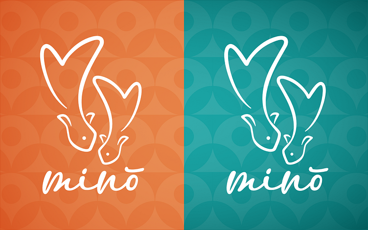
In addition to the primary logo variation, I explored an alternate version featuring a pair of charming little fish, each with tails shaped like the letter "M." This variation further reinforces the studio's identity and provides versatility in branding applications.