Case Study: Valiant Creek Realty Logo Design

Case Study: Valiant Creek Realty Logo Design
Client Brief
Valiant Creek Realty, a dynamic real estate firm, sought a logo that would embody their values of strength, reliability, and growth in the property market.
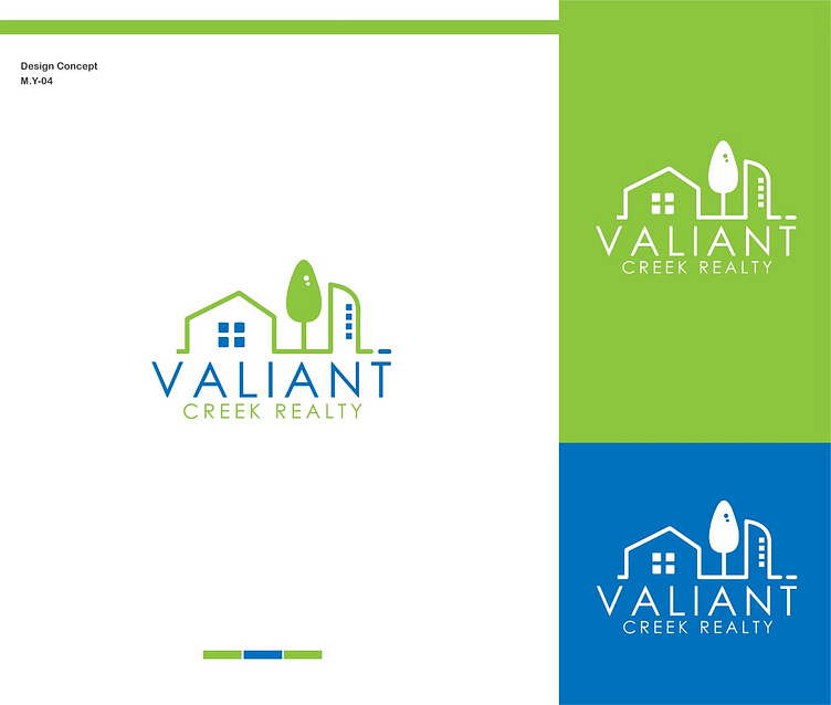
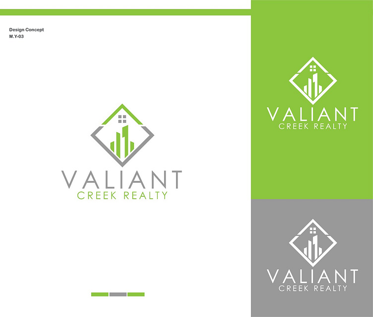
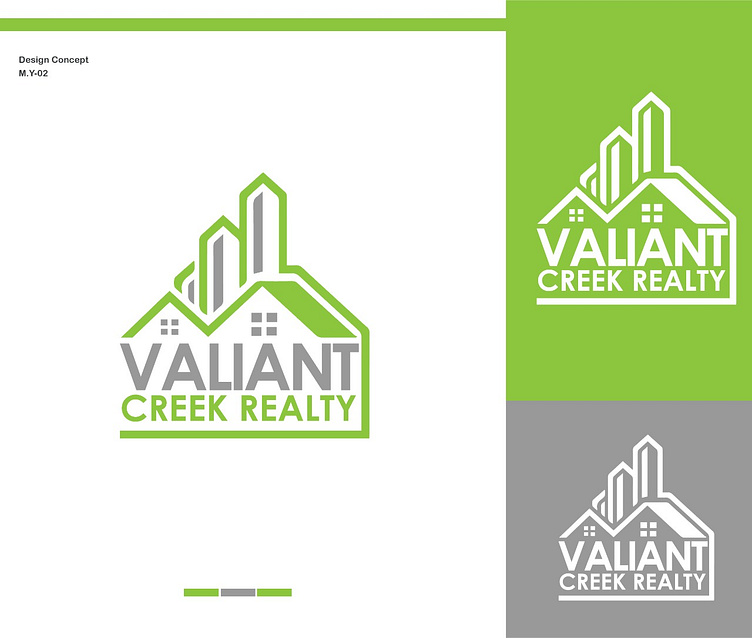
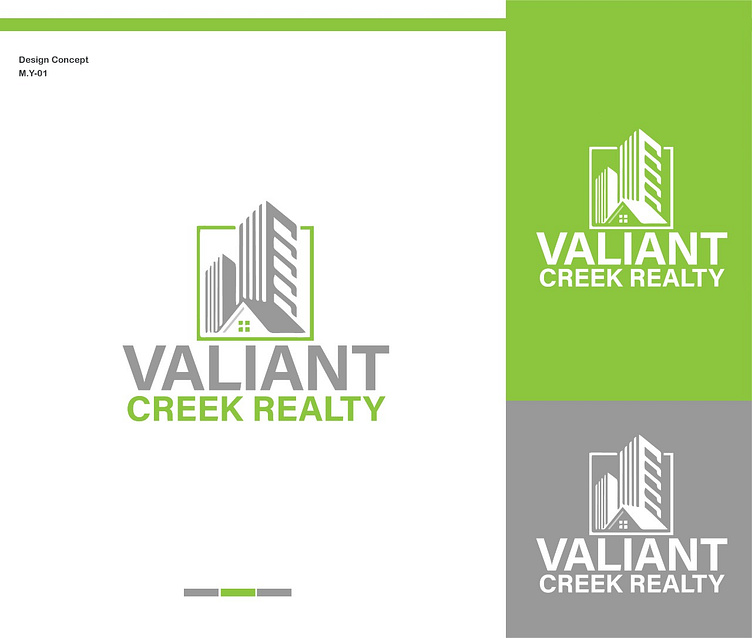
Design Concept
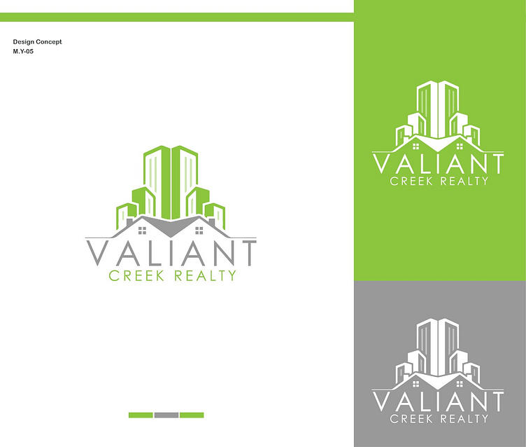
Articon Design Agency proposed a logo concept labeled Valiant Creek that would resonate with the firm’s vision. The design features an abstract representation of buildings, symbolizing the company’s foundation in real estate.
Color Palette
The logo utilizes a green and grey color scheme. Green represents growth and prosperity, while grey stands for professionalism and balance.
Variations
Three variations were created to ensure versatility across different mediums:
Primary Logo: Combines green and grey, suitable for official branding.
Green Scheme: A monochromatic version for impactful branding on green backgrounds.
Grey Scheme: A subtle variation for use in grey or monochrome settings.
Reception
The logo was well-received by Valiant Creek Realty, who felt it perfectly captured their brand essence. It has since been implemented across their marketing materials, enhancing their brand recognition.
Conclusion
Articon Design Agency’s thoughtful approach to the Valiant Creek Realty logo design resulted in a versatile and meaningful brand symbol that stands out in the competitive real estate market.
I hope this case study provides a comprehensive overview of the creative process and the successful outcome of the logo design project. If you need further details or adjustments, feel free to ask! 🎨✨


