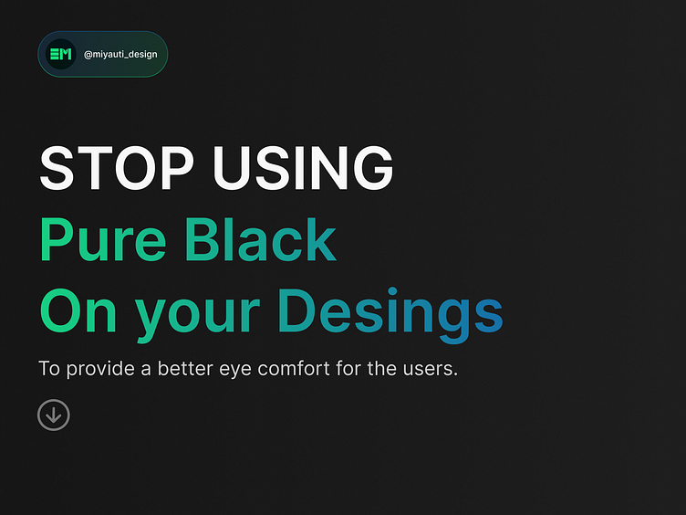
Stop Using Pure Black on Your Desings


👀 Dive into the world of digital wellbeing with our latest insights on how to design for the best!
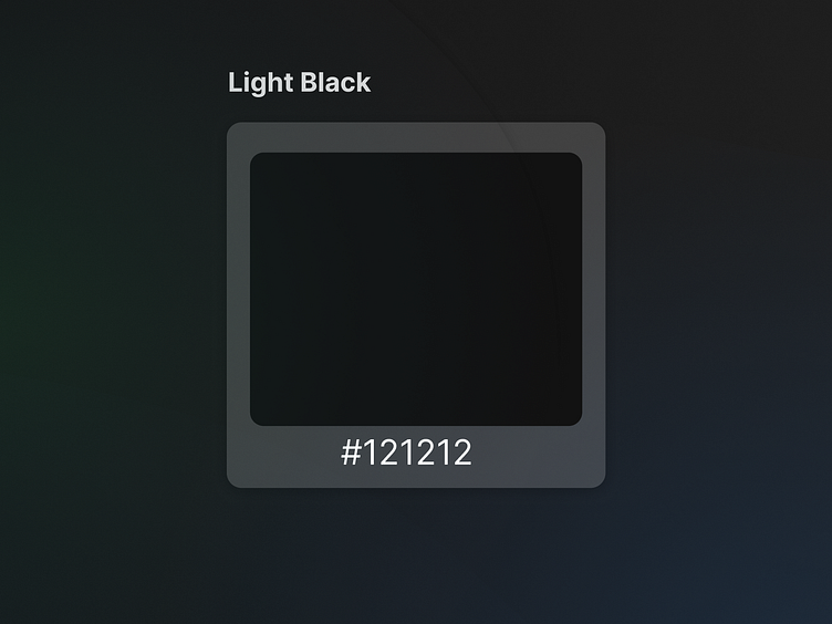
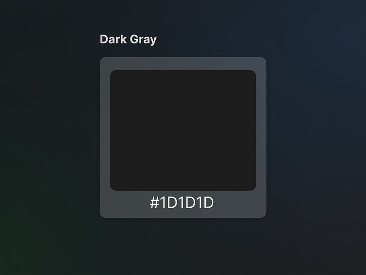
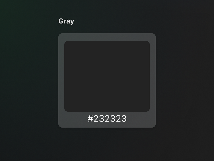
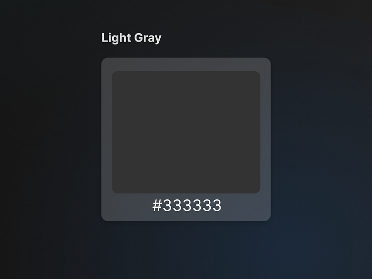
⚫️ Why avoid solid black? It increases eye strain, while dark gray decreases it, improving reading stamina.
🎨 Pure black and white, high-contrast colors, can be hard on the eyes. Opt for subtle shades to create a visually comfortable experience and reduce eye strain.
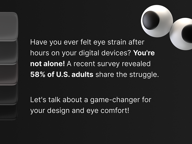
📊 Surveys show that most people suffer from digital eye strain due to overexposure to computers.
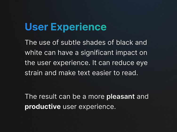
🌟 Prioritize wellbeing in design - it's not just about visuals, it's about a commitment to user comfort.


