Users Page Re-Vamp

Our current user page uses an old code and is complicated for our users to use. By bringing a re-vamped design with better groupings and workflow, will allow our users to have a better experience.

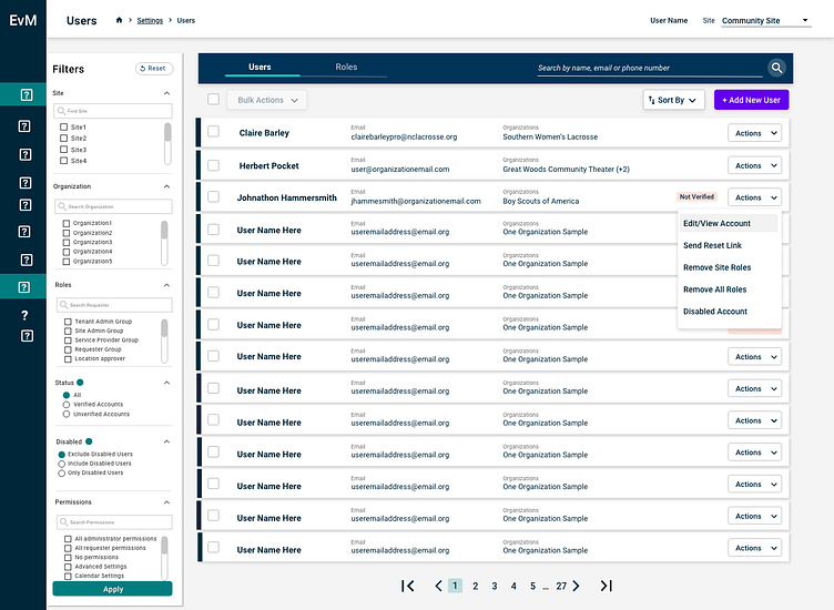
Current User Page
Above^ is what our current user page looks like. As you can see it looks like it was built in the 1990s. I think there are a lot of things wrong with just even seeing this screenshot but before we get started here a couple of points to bring up of what we learned in discovery interviews.
People don't know the difference between user and visitor. It took us SO long to figure out what it is. Turns out a visitor IS a user it just has no permissions. So you can think of this as "users" are school staff, and "visitors" are people not affiliated with the school but are requesting to have an event there.
People couldn't figure out where "add new user is". As you can see it blends in with the rest of the greys.
When going to editing the profile it was hard to understand in the "role access" section what was included and what was added.
The save button doesn't float so its easy for the user who is at the top of the page to assume everything is going to be automatically saved.
User Testing
We interviewed internal implementation team, as well as 8 other clients to get this feedback.
What we learned
keep the design similiar so it isn't confusing to the user
make it easier for them to navigate since they have to do a lot of back and forth
maybe add a search functionality to see all the roles they can have
easily show what is a global role vs. not
1st screens after initial testing
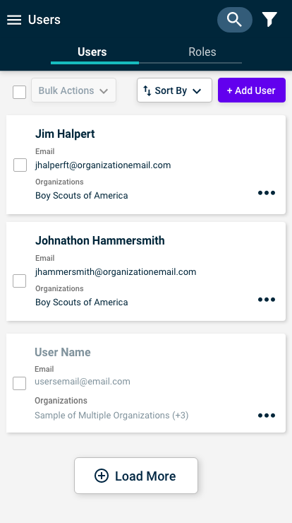
main page was mirrored after another page that is already in this program. So we followed a similar style. Based off client interviews we discovered that underneath actions that the most important ones are edit/view account and send reset link. We decided to put the removing ones towards the bottom since that is a less likely actions users will take.

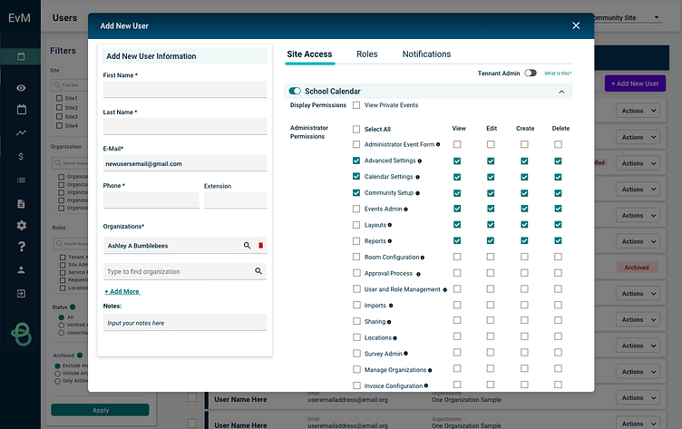

View/Edit Account: There are 3 options of this, and the reason being is because the system is more complicated than we thought. With a user being able to have global permissions as well as "site only" permissions is where our problem is. We thought of adding the view,edit,create, delete options so that users could have more control of what people could have access to.
User Testing - Round 2
We user tested the screens above with various scenarios for 5 clients. To do this we sent a link to each XD file on a zoom call, and would give certain scenarios to each user and have them rank the difficulty on scale 1-5.
Results: We learned that the view,edit, delete, was too complicated for our users since yes it gave more customization but it wasn't something that they needed. The good news they thought all the layouts were way better than what they currently have because the information they could access. However something we could not solve is the missing link between roles and the permissions (since some roles have permissions) so that counteracts the permission tab..SOOOO to solve that problem .....
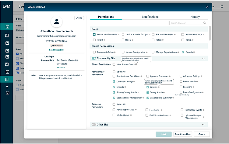
We combined them! - trust me this took a lot of whiteboard thinking
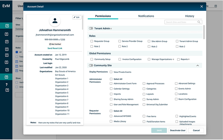
How: So like I said we decided to group permissions and roles since they interact with each other. We still kept the "tenant admin" but made it more obvious at the top since its an "all access" permission". The roles (which can be seen in the image below). Can have pre-selected permissions so when you click a role then it is reflected below. With global permissions this is somethign the system already has and just allows access from all the sites here.
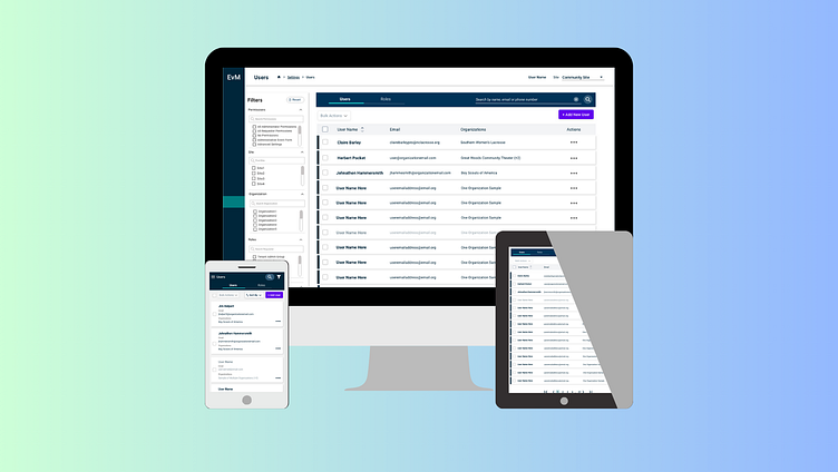
Final Designs
Main Screen for Mobile


for web only..we decided to do a "quickview" since this mirrors other areas in the system.
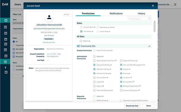
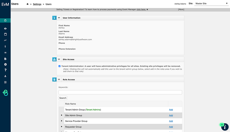
Even for de-activated users we wanted users to be able to see what the previous permissions were so we just had it at a 50% opacity, and we made it easy for the user for when they want to re-activate it keeps all permissions and roles previously selected. ** Note the reason this screenshot looks different from the others because it is an old screenshot, some design files of mine got lost in a system transition unforunately :( **
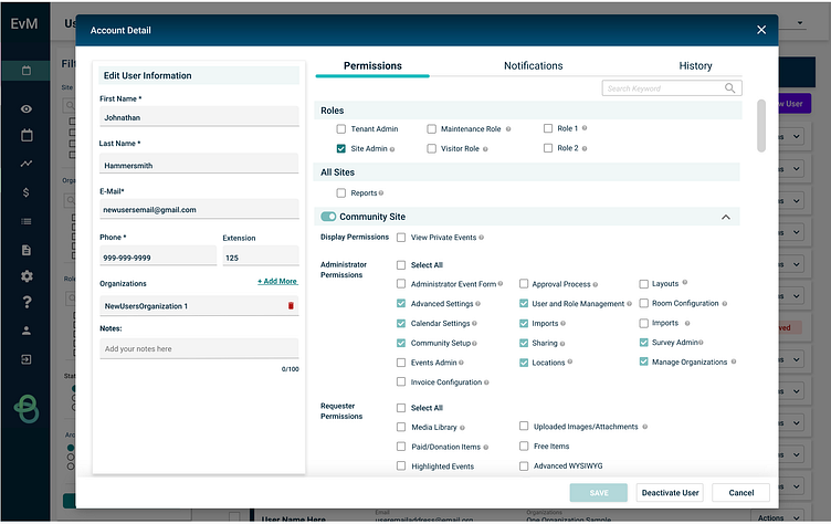
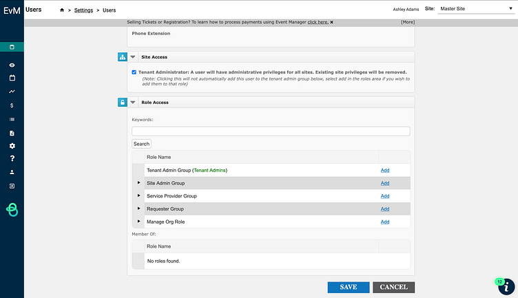
when editing a profile this is what we landed on. This is consistent with what the program currently has and allows the user to know with the grey boxes of where to edit and how to save. ** Note the reason this screenshot looks different from the others because it is an old screenshot, some design files of mine got lost in a system transition unforunately :( **


