Smartsimple Elevate Conference | Brand, Print, Landing Page

Overview
Smartsimple is a software company that produces custom software for businesses to handle their critical processes. Elevate is their annual conference for their clients to connect, learn and share how they use the platform. It was up to me to come up with the branding for the event.
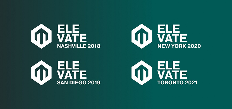
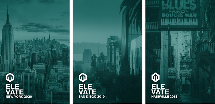
The Travelling Identity
The locale changes annually. We wanted a solution that was easy to implement and adapt to the new location every year, and also feel consistent with the company’s established branding. I used Smartsimple’s main teal colour as an overlay for the background. The background image can easily change every year depending on where the event is being held.
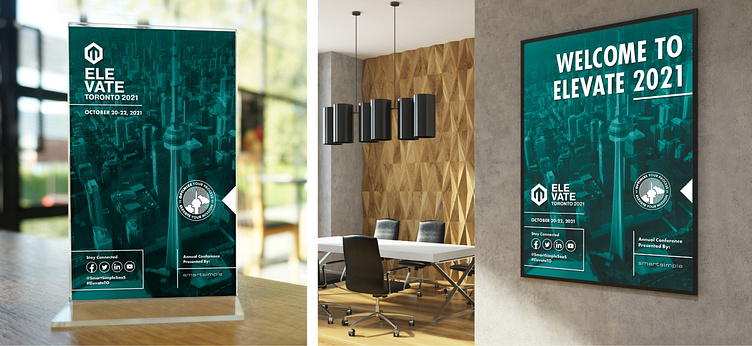
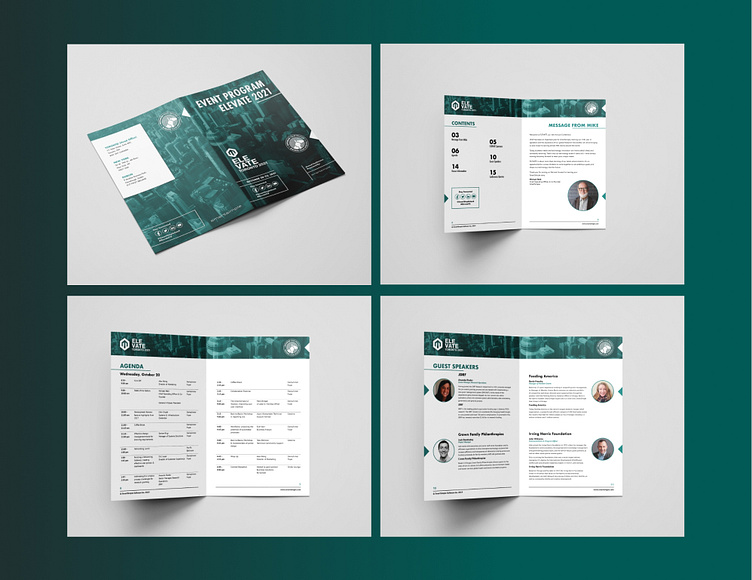
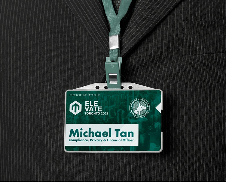
All Uphill From Here
The logo icon is a combination of a high-rise building, an upward arrow and a sideways “E”. The type was stacked to look like a staircase climbing up, and along with the chosen photography from up high in the clouds, we have created a system that constantly references the heights that your clients will elevate to in attending this event.
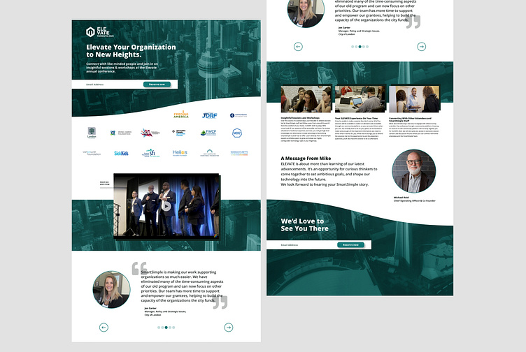
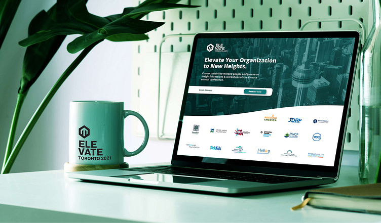
Taking The High Road
For the website, the main idea was having the CN tower is a background image that you can see as you scroll down, until you reach the bottom of the page. This plays to the sense of height the brand is known for.
Thanks for reading!
If you'd like to work together, you can email me at:
robdaniels.design@gmail.com


