Banking App

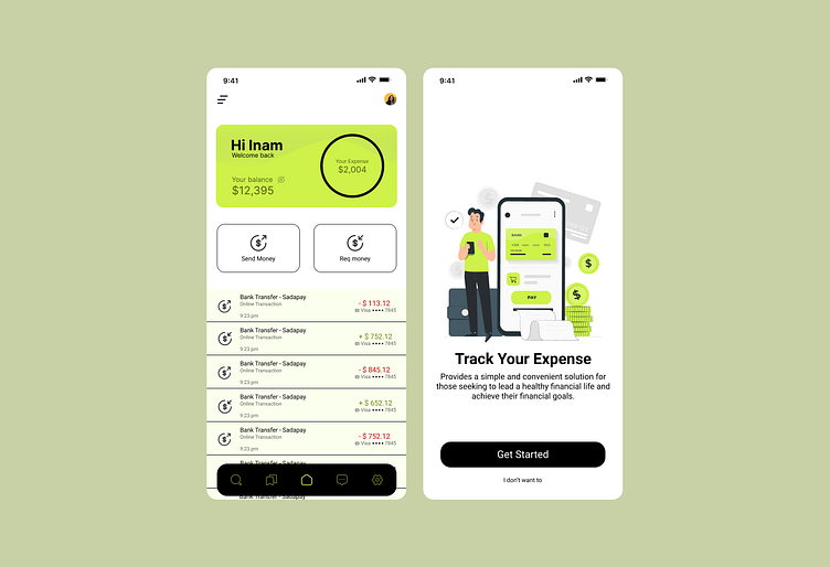
Designing a banking app in bright lettuce green colors creates a vibrant and visually striking interface, injecting a sense of energy and dynamism into the user experience. The bright lettuce green palette lends the app a modern and stylish appearance, making it easily distinguishable among other apps in the market.
This color choice not only grabs the user's attention but also enhances the user experience. Bright colors can help make key interface elements, such as action buttons or notifications, more noticeable and easily discoverable for the user. As a result, users can interact with the app quickly and confidently, improving its usability.
Overall, designing a banking app in bright lettuce green colors represents a bold and contemporary approach that can help capture and retain user attention while highlighting the bank's innovative image.


