Bemo Visual Identity


Redefining Bemo: new visual identity and website for their creative studio specializing in visual effects and animation.
—
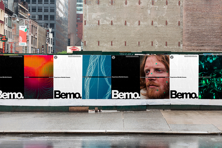
Having such an extensive and visually captivating portfolio, we decided that the best approach to this redesign would be to give visual priority to their works. We achieved this by crafting a visual language that uses design elements only as functional or guiding information, placed in carefully crafted grid systems.
All typography is standardized under the Neue Haas Grotesk Display typeface and the identity utilizes an achromatic palette which enhances the vibrancy of the works. Information is strategically placed using the difference effect or within a vector line going along the middle of the format. The line serves both as a focal guiding point and becomes the main brand asset that distinguishes the identity from others.
These core design choices aim to render Bemo's new identity as both sleek and sophisticated, seamlessly complementing and showcasing their stunning visual narratives.
Full case study: alphamark.design/project/bemo/Bemo
Website: bemo.studio
—
We are available for collaboration!
Work with us:hello@alphamark.design